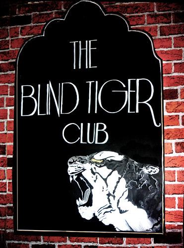
Brighton's one and only speakeasy organised by Playgroup. The pop up club is based on a 1920's illegal speakeasy.
I was asked to make a pub sign and given a large piece of MDF, some paint and one day to have it finished.
I chose an art deco style arch shape for the top of the sign a matching art deco font so the sign would be in keeping with the 1920's roots of the club. I copied the tiger off the smaller-than-A6 flyer that i was given for the night and i painted the eye in a gold ink.

I was asked to design an image that would fit this 12' by 3' sign behind the bar at Hectors House, Brighton. It needed to be in sections so that drinks information could be written displayed. I came up with this design of Brighton Pavilion, dilapidated. I wanted to do a bold structural design that would work well in white on black. I had limited materials, just chalk and white chalk pens, and the sign is 8foot up the wall so the whole thing had to be drawn up a wobbly ladder.
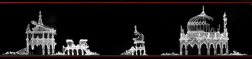
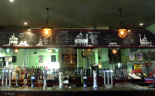
After getting the go ahead for the design by the manager and by Playgroup, the promoters of the venue, and having done a couple of days work on it, the owner of the pub came to have a look. He, Nick Griffin, no, not that one, was unsure about the message that the pub could be seen to be giving by my design. He thought the establishment could be perceived to be endorsing terrorism.
We had a little chat, I explained that my design was ambiguous. It was about structure and line work. and the play on using a Brighton symbol like the Pavilion was not violent but fitting with the location of the pub as well as the size and spacing of the board. It was playful, tis all. And in any case, it was a little late now.

The majority of my sign writing work has been for The Lexington, Pentonville road, London. Its a Bourbon pub with an American theme. Most of my jobs there are writing up the lists of over 90 bourbons that they have across 2, 3' by 8' boards that hang behind the bar. Rewriting their menus, wine and all American beers lists. This is the Western style font I found to fit in with the all American theme.
No comments:
Post a Comment